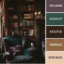
The dark academia color palette is one of the defining elements of the dark academia aesthetic. This palette brings together moody, rich, and sophisticated tones that evoke the feeling of classic literature, historic universities, antique libraries, and timeless scholarly spaces. In this article, we explore everything you need to know about the dark academia color palette, from its origins and core colors to practical applications in interiors, fashion, and digital design. .
What Is the Dark Academia Color Palette?
The dark academia color palette consists of rich, deep, and muted tones that reflect an intellectual, nostalgic, and romantic aesthetic. These colors are often inspired by historic university interiors, old libraries, vintage furniture, and classical art. The palette is designed to create warmth, intimacy, and depth while maintaining a sense of sophistication and timeless elegance.
Common colors in the dark academia palette include:
- Deep greens (forest, moss, and olive tones)
- Burgundy and oxblood reds
- Dark browns and espresso
- Charcoal gray and slate tones
- Navy and midnight blue
- Muted creams, taupe, and antique ivory as accent colors
This combination allows for contrast while maintaining the overall moody and intellectual aesthetic. The colors are versatile and can be used across interiors, fashion, and even digital design projects.
Origins of the Dark Academia Palette
The roots of the dark academia color palette trace back to classical European education, Gothic architecture, and the Romantic era. Universities such as Oxford and Cambridge, with their stone halls, aged wood, and candlelit libraries, heavily influenced the aesthetic. Richly colored tapestries, leather-bound books, and oil paintings contributed to the visual language of the palette.
In modern times, social media, literature, and pop culture have propelled the dark academia palette into contemporary design. Its appeal lies in its ability to evoke emotion, intellect, and nostalgia simultaneously.
Core Elements of the Dark Academia Palette
The palette is not just about individual colors but about how these colors work together. When designing a space or creating visuals, consider the following core elements:
Dark and Moody Tones
The foundation of the palette consists of deep, moody colors such as forest green, burgundy, charcoal, and navy. These shades evoke a sense of mystery, elegance, and intellectual depth.
Neutral Accent Colors
To balance the darkness, muted neutrals such as cream, taupe, and antique ivory are incorporated. These tones add lightness, prevent visual heaviness, and highlight focal points in a room or design.
Natural Textures and Materials
The palette is complemented by natural textures like wood, leather, velvet, and linen. These materials not only enhance the visual richness but also contribute to the tactile and sensory experience of dark academia.
Using the Dark Academia Color Palette in Interior Design
One of the most popular applications of the dark academia palette is in interior design. Whether you are designing a living room, bedroom, study, or library, these colors create a timeless, scholarly environment.
Living Rooms
Use deep green or charcoal on walls to create a moody backdrop. Accent with burgundy velvet sofas, antique wooden furniture, and brass lamps. Add stacks of books, classical artwork, and Persian rugs for a layered, intellectual feel.
Bedrooms
Dark academia bedrooms benefit from deep navy or oxblood walls paired with layered textiles in velvet or linen. Wooden or metal bed frames, antique nightstands, and warm lighting enhance the cozy, scholarly atmosphere.
Home Offices and Studies
For studies, use dark brown desks, forest green walls, and brass or bronze desk lamps. Shelves overflowing with leather-bound books, classical busts, and vintage globes create a productive yet aesthetically pleasing workspace.
Walls and Artwork
Incorporate the color palette through wall paint, wallpaper, and framed art. Textured wallpapers in muted tones or deep patterns evoke historical sophistication, while classical paintings and sketches add authenticity.

Applying the Dark Academia Palette in Fashion
The dark academia color palette is also widely used in fashion, particularly menswear and womenswear. Layered clothing in muted, earthy tones, tweed jackets, plaid trousers, wool scarves, and leather shoes reflect the intellectual, vintage-inspired aesthetic.
Accessories such as watches, leather satchels, and antique-inspired jewelry further reinforce the style. The palette emphasizes layering, texture, and cohesion rather than bright or flashy colors.
Digital Design and Creative Applications
Graphic designers, illustrators, and content creators also use the dark academia color palette. Websites, social media visuals, posters, and clip art benefit from the palette’s moody tones and timeless appeal.
For digital design, pairing deep background tones with muted accent colors ensures readability while maintaining the scholarly aesthetic. Typography choices in serif fonts or calligraphic styles complement the visual language of the palette.
Tips for Combining Colors Effectively
- Contrast: Pair dark tones with muted neutrals to prevent heaviness.
- Layering: Use textures such as velvet, leather, and wood to add depth.
- Accents: Incorporate accent colors in cushions, rugs, artwork, or lamps.
- Lighting: Warm lighting enhances moody tones and creates a cozy ambiance.
- Consistency: Maintain a cohesive palette across the room or design for authenticity.
Benefits of Using the Dark Academia Palette
- Timeless Appeal: The combination of moody tones and muted accents never goes out of style.
- Emotional Depth: The palette evokes nostalgia, curiosity, and intellectual engagement.
- Versatility: Applicable in interiors, fashion, and digital media.
- Sophistication: Rich, deep colors instantly elevate spaces and designs.
- Layered Aesthetic: Enables creative layering of materials, colors, and textures.
Common Mistakes to Avoid
- Overusing Dark Tones: Balance is crucial to prevent spaces from feeling oppressive.
- Ignoring Lighting: Moodey colors require thoughtful lighting to avoid gloom.
- Mixing Incompatible Colors: Stick to the palette’s core tones for cohesion.
- Neglecting Texture: Flat finishes can make dark tones feel cold and lifeless.
Conclusion
The dark academia color palette is a versatile and timeless tool for creating moody, sophisticated, and intellectually inspired spaces. Whether applied in interiors, fashion, or digital design, it evokes nostalgia, elegance, and scholarly charm. By combining deep tones, muted accents, layered textures, and thoughtful lighting, anyone can bring the rich aesthetic of dark academia into their home or creative projects. The palette’s timeless appeal ensures that these spaces remain elegant and inviting for years to come, making it a must-have for enthusiasts of vintage, intellectual, and moody design.


